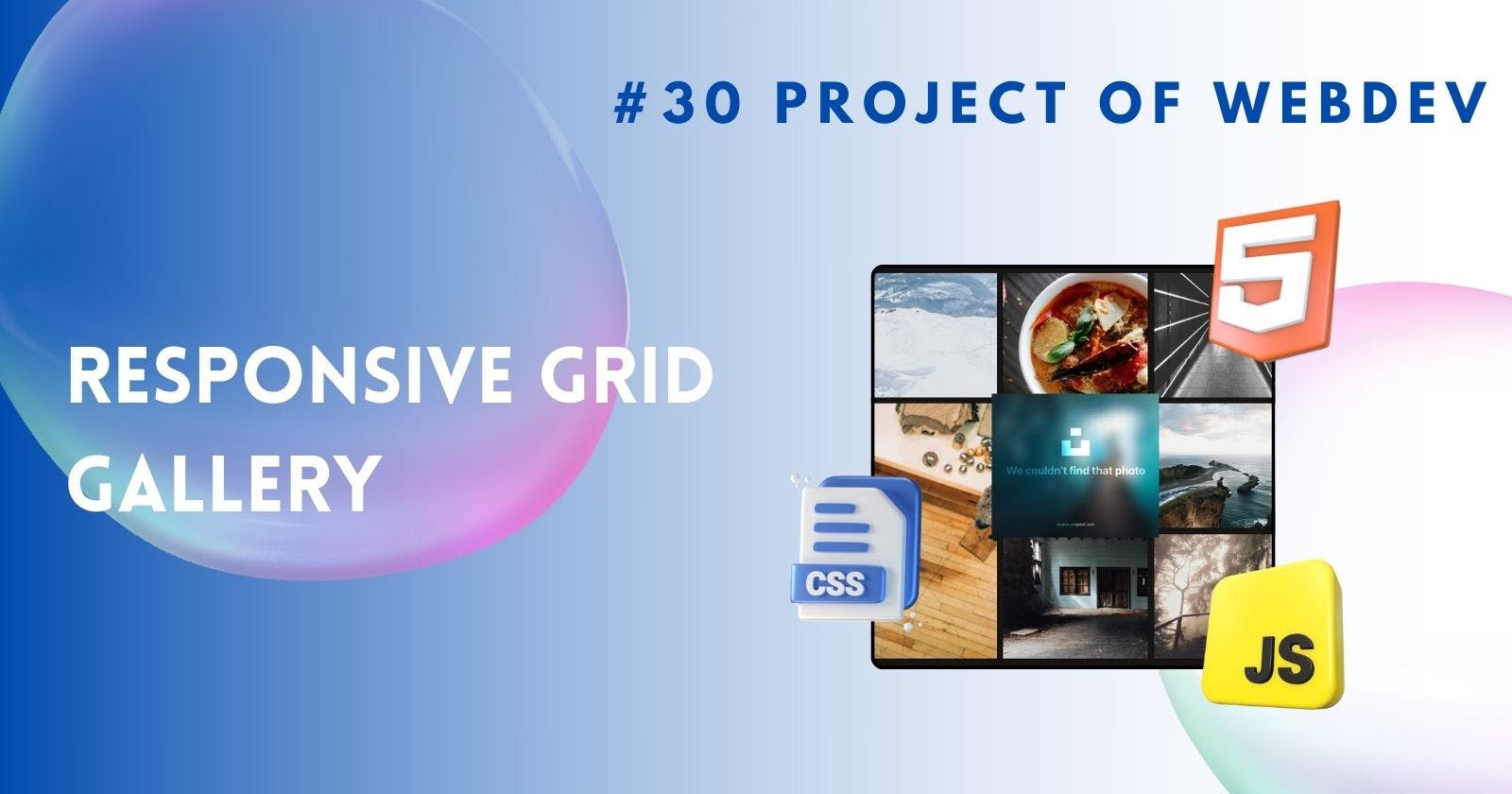
Creating Gallery Using Grid System
Making Stunning Gallery with CSS Grid: A Step-by-Step Guide
Creating Gallery Using Grid in CSS
With the evolution of web design, creating visually stunning galleries has become a crucial aspect of building engaging websites. CSS Grid emerges as a powerful tool, offering flexibility and control over layout design. In this article, we'll delve into the process of crafting captivating galleries using CSS Grid, step by step.
Introduction to CSS Grid
CSS Grid, a layout system introduced in CSS3, revolutionizes the way we design website layouts. Unlike traditional methods like floats or positioning, CSS Grid provides a two-dimensional grid-based layout system, allowing precise control over both rows and columns.
Setting up the HTML structure
Before diving into styling, let's set up the basic HTML structure for our gallery. We'll create a container to hold our images and define grid areas within it.
  <div class="container">
      <div class="gallery">
        <div class="gallery__item gallery__item--h">
          <img src="./image.png" alt="" />
        </div>
        <div class="gallery__item">
          <img
            src="./image.png"
            alt=""
          />
        </div>
        <div class="gallery__item">
          <img src="./image.png" alt="" />
        </div>
        <div class="gallery__item gallery__item--v">
          <img
            src="./image.png"
            alt=""
          />
        </div>
        <div class="gallery__item gallery__item--lg">
          <img
            src="./image.png"
            alt=""
          />
        </div>
        <div class="gallery__item">
          <img
            src="./image.png"
            alt=""
          />
        </div>
        <div class="gallery__item">
          <img
            src="./image.png"
            alt=""
          />
      </div>
    </div>
Styling the gallery container
Once the HTML structure is in place, we'll move on to styling the gallery container using CSS Grid properties. This involves defining the grid layout, setting column and row sizes, and specifying the gap between grid items for better spacing.
.gallery {
    display: grid;
    grid-gap: 10px;
    grid-template-columns: repeat(auto-fit, minmax(200px, 1fr));
    grid-auto-rows: 200px;
    grid-auto-flow: dense;
    max-width: 1200px;
    margin: 10px auto;
    padding: 0 10px;
}
.gallery__item {
    align-items: center;
    display: flex;
    justify-content: center;
}

.gallery__item>img {
    height: 100%;
    object-fit: cover;
    width: 100%;
}

.gallery__item--h {
    grid-column: span 2;
}

.gallery__item--v {
    grid-row: span 2;
}

.gallery__item--lg {
    grid-column: span 2;
    grid-row: span 2;
}
Adding images to the gallery
Next, we'll import images into our project and insert them into the grid items within the gallery container. This step lays the foundation for showcasing our images in a visually appealing manner.
Here We used splash API to display images
<!--https://source.unsplash.com/random/500x500-->
Adding hover effects
To further engage users, we can incorporate hover effects that trigger when users interact with gallery items. These effects add interactivity and visual interest to our gallery.
.gallery__item>img:hover {
    height: 100%;
    object-fit: cover;
    transform: scale(1.2);
    width: 100%;
}
Output
Conclusion
In conclusion, CSS Grid offers a powerful yet flexible solution for creating captivating galleries on the web. By following the steps outlined in this article and experimenting with different techniques, you can elevate your website's visual appeal and user experience.
FAQs
Is CSS Grid supported in all browsers? CSS Grid is supported in most modern browsers, including Chrome, Firefox, Safari, and Edge. However, it's essential to provide fallbacks for older browsers that may not support it fully.
Can I use CSS Grid with other layout systems? Yes, CSS Grid can be used in conjunction with other layout systems like Flexbox to achieve more complex layouts and designs.
How can I make my gallery accessible to visually impaired users? You can make your gallery accessible by providing descriptive alternative text for images and ensuring proper keyboard navigation and focus management.
Are there any performance considerations when using CSS Grid for galleries? While CSS Grid offers flexibility in layout design, it's essential to optimize performance by minimizing CSS and optimizing image loading for faster page load times.
Can I customize hover effects in my gallery? Yes, you can customize hover effects using CSS transitions, animations, or JavaScript to create unique interactive experiences for users.
Happy Coding ! 🚀
