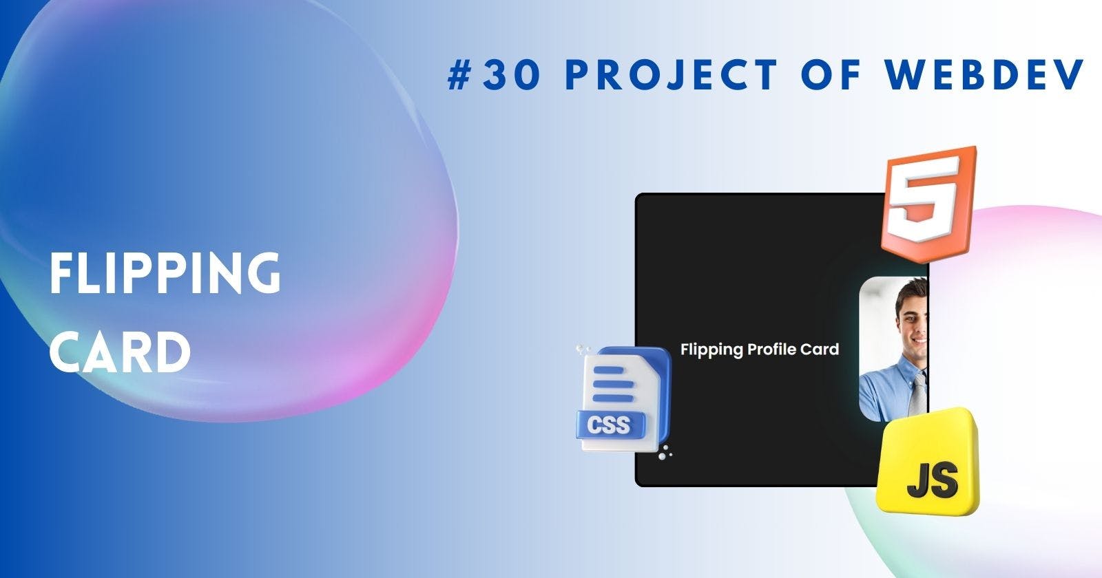
Creating Flipping Card using CSS Animations
Flipping Cards: CSS Animation for Engaging Web Experiences
Web design has evolved dramatically over the years, with designers constantly seeking innovative ways to engage and interact with users. One such technique that has gained popularity is the creation of flipping cards with CSS on hover animation. These dynamic elements not only add visual appeal to websites but also provide an interactive experience for visitors. In this challenge, we'll explore the ins and outs of creating flipping cards using CSS, covering everything from basic structure to advanced techniques.
Introduction to Flipping Cards with CSS
Flipping cards, also known as flip cards or flip panels, are elements that simulate the flipping motion of a card when interacted with. This effect can be achieved using CSS transitions and transformations, allowing for smooth animations that enhance user experience. The primary purpose of flipping cards is to present information in a visually appealing manner, making it easier for users to digest content.
Understanding CSS Transitions and Transformations
Before diving into the creation of flipping cards, it's essential to understand the fundamentals of CSS transitions and transformations. CSS transitions allow for the smooth transition between different property values over a specified duration, while CSS transformations enable the manipulation of elements in 2D and 3D space. By combining these two features, we can create realistic flipping effects that captivate users.
Basic Structure of Flipping Cards
The structure of flipping cards consists of two main components: the front face and the back face. The front face typically contains the primary content or image, while the back face can display additional information or details. To create flipping cards, we use HTML to define the structure and CSS to style and animate the elements accordingly.
 <h1>Flipping Profile Card</h1>
    <div class="card">
      <div class="front">
        <img src="./profiledoe.jpg" alt="" />
      </div>
      <div class="back">
        <h3>John Doe</h3>
        <p>Web Developer</p>
        <span>Skills</span>
        <div id="skills">
          <p>HTML</p>
          <p>CSS</p>
          <p>JavaScript</p>
          <p>React</p>
        </div>
      </div>
    </div>
Let's Style it with CSS:
/* Styling for the card container */
.card {
    width: 250px;
    height: 300px;
    position: relative;
    transform-style: preserve-3d;
    transition: transform 0.5s;
    -webkit-box-shadow: 7px 5px 93px -27px rgba(31, 178, 186, 1);
    -moz-box-shadow: 7px 5px 93px -27px rgba(31, 178, 186, 1);
    box-shadow: 7px 5px 93px -27px rgba(31, 178, 186, 1);
    border-radius: 40px;
    margin: 20px;
}

/* Styling for front face of the card */
.front > img {
    width: 100%;
    height: 100%;
    position: absolute;
    border-radius: 40px;
    backface-visibility: hidden;
}


/* Styling for both front and back faces of the card */
.card .front,
.card .back {
    width: 100%;
    height: 100%;
    position: absolute;
    backface-visibility: hidden;
}

/* Styling for the front face */
.card .front {
    background-color: #f00;
    border-radius: 40px;
}

/* Styling for the back face */
.card .back {
    background-color: #1d1d1d;
    border: 5px solid rgba(31, 178, 186, 1);
    border-radius: 40px;
    transform: rotateY(180deg);
    display: flex;
    justify-content: center;
    flex-direction: column;
    align-items: center;
}

/* Styling for back face elements */
.card .back > h3 {
    color: rgba(31, 178, 186, 1);
    border: 2px solid rgba(31, 178, 186, 1);
    padding: 3px 10px;
}

.card .back > p {
    color: whitesmoke;
    margin: 0;
}

.card .back > span {
    background-color: rgba(31, 178, 186, 1);
    color: #1d1d1d;
    padding: 1px 10px;
    margin: 15px 0 5px 0;
    border-radius: 5px;
}

/* Styling for the skills section */
#skills {
    display: flex;
    gap: 5px;
    width: 100%;
    justify-content: center;
    flex-wrap: wrap;
}

#skills > p {
    color: rgba(31, 178, 186, 1);
    font-size: 10px;
    font-weight: 900;
    border: 2px solid rgba(31, 178, 186, 1);
    border-radius: 50px;
    padding: 3px 8px;
}
Creating the Flip Animation
The flip animation is the heart of flipping cards, as it simulates the motion of flipping a physical card. This effect is achieved by applying CSS transitions to the rotation property, causing the card to rotate along its axis when interacted with. By specifying the duration and timing function of the transition, we can control the speed and smoothness of the flip animation.
.card {
    transform-style: preserve-3d;
    transition: transform 0.5s
}
/* Card animation on hover */
.card:hover {
    transform: rotateY(180deg);
}
Output
Click Here If Embed Not Works
Examples and Inspirations
To spark creativity and inspire new ideas, it's helpful to explore examples of flipping card designs in action. From portfolios to e-commerce websites, flipping cards can be found in a wide range of contexts, each showcasing unique approaches to design and interaction. By studying these examples, designers can gain valuable insights and apply them to their projects.
Conclusion
In conclusion, creating flipping cards with CSS on hover animation is a fun and effective way to add interactivity to web design. By mastering the fundamentals of CSS transitions and transformations, designers can create engaging and visually compelling flipping effects that enhance user experience. Whether it's showcasing products, highlighting portfolio pieces, or presenting information, flipping cards offer endless possibilities for creativity and innovation in web design.
FAQs
Can flipping cards be used on mobile devices?
- Yes, flipping cards can be made responsive and work well on mobile devices with proper CSS styling and media queries.
Are flipping cards accessible to users with disabilities?
- With proper HTML structure and descriptive alt text, flipping cards can be made accessible to users with disabilities, including those using screen readers.
Do flipping cards affect website performance?
- While flipping cards can add visual flair to a website, proper optimization techniques can help mitigate any impact on performance, ensuring smooth animations and fast loading times.
Can flipping cards be customized to match a website's design aesthetic?
- Yes, flipping cards can be customized extensively using CSS to match the design aesthetic of any website, from color schemes to typography.
Are there any libraries or frameworks available for creating flipping cards?
- Yes, there are several libraries and frameworks, such as Bootstrap and Materialize CSS, that offer pre-built components for creating flipping cards, making the process easier and more efficient.
